Product Design System
  • Welcome
  • Design system
    • What is VPDS? - What is VPDS?
    • Accessibility
    • Design principles
    • Inclusive design
    • FAQs
    • Latest news
    • Releases
    • Get started - Start designing with VPDS
    • Design kits
    • Brand guidance for productsfor the Brand guidance for products
    • Get started - Start developing with VPDS
      • Get started - Start building with Angular
      • Accessibility utilitiesfor Angular
        • App ready check
        • Floating UI
        • Nova library
        • Unique ID generator
      • Changelogfor Angular
      • Get started - Start building with Flutter
      • Accessibility utilitiesfor Flutter
      • Changelogfor Flutter
      • Get started - Start building with React
      • Accessibility utilitiesfor React
        • useCardNumberValidation
        • useDebounce
        • useFocusTrap
      • Changelogfor React
      • Get started - Start building with Nova styles
      • Accessibility stylesfor Styles (CSS)
      • Changelogfor Styles (CSS)
        • Action primary
        • Action secondary
        • Input
        • Message
    • Overview - Base elements
    • Color
    • Elevation
    • Responsive grid system
    • Size and shape
    • Spacing
    • States
    • Surface
    • Typography
      • Overviewfor Design tokens
      • Tokens for designers
      • Tokens for developers
    • Overview - Components
    • Accordion
    • Anchor link menu
    • Avatar
    • Badge
    • Banner
    • Breadcrumbs
    • Button
    • Checkbox
    • Chips
    • Color selector
    • Combobox
    • Content card
    • Date and time selectors
    • Dialog
    • Divider
    • Dropdown menu
    • Flag
    • Footer
    • Horizontal navigation
    • Icons and illustrations
    • Input
    • Link
    • List item
    • Listbox
    • Multiselect
    • Navigation drawer
    • Pagination
    • Panel
    • Progress
    • Radio
    • Section message
    • Select (native)
    • Slider
    • Switch
    • Tab bar
    • Table
    • Tabs
    • Toggle button
    • Tooltip
    • Top app bar
    • Vertical navigation
    • Overview - Patterns
    • Address
    • Application layouts
    • Card input
    • Chat
    • Dynamic table
    • Feedback and status
    • File upload
    • Forms
    • Notification tray
    • One-time passcode
    • Search
    • Wizard
    • Overview - Content
    • Accessible text
    • Grammar and punctuation
    • Inclusive language
    • Information architecture
    • Messaging
    • Placeholder text
    • Readability
    • Voice and tone
    • Visa Chart Components - Visa Chart Components
    • Development setup
      • Overviewfor the Data Visualization design guidelines
      • Data visualization principles
      • Selecting a chart
      • Overviewfor the Data Visualization chart components
      • Bar chart
      • Dumbbell plot
      • Heatmap
      • Line chart
  • Support
  • Welcome
  • Overview
    • What is VPDS? - What is VPDS?
    • Accessibility
    • Design principles
    • Inclusive design
    • FAQs
    • Latest news
    • Releases
    • Get started - Start designing with VPDS
    • Design kits
    • Brand guidance for productsfor the Brand guidance for products
    • Get started - Start developing with VPDS
      • Get started - Start building with Angular
      • Accessibility utilitiesfor Angular
        • App ready check
        • Floating UI
        • Nova library
        • Unique ID generator
      • Changelogfor Angular
      • Get started - Start building with Flutter
      • Accessibility utilitiesfor Flutter
      • Changelogfor Flutter
      • Get started - Start building with React
      • Accessibility utilitiesfor React
        • useCardNumberValidation
        • useDebounce
        • useFocusTrap
      • Changelogfor React
      • Get started - Start building with Nova styles
      • Accessibility stylesfor Styles (CSS)
      • Changelogfor Styles (CSS)
        • Action primary
        • Action secondary
        • Input
        • Message
    • Overview - Base elements
    • Color
    • Elevation
    • Responsive grid system
    • Size and shape
    • Spacing
    • States
    • Surface
    • Typography
      • Overviewfor Design tokens
      • Tokens for designers
      • Tokens for developers
    • Overview - Components
    • Accordion
    • Anchor link menu
    • Avatar
    • Badge
    • Banner
    • Breadcrumbs
    • Button
    • Checkbox
    • Chips
    • Color selector
    • Combobox
    • Content card
    • Date and time selectors
    • Dialog
    • Divider
    • Dropdown menu
    • Flag
    • Footer
    • Horizontal navigation
    • Icons and illustrations
    • Input
    • Link
    • List item
    • Listbox
    • Multiselect
    • Navigation drawer
    • Pagination
    • Panel
    • Progress
    • Radio
    • Section message
    • Select (native)
    • Slider
    • Switch
    • Tab bar
    • Table
    • Tabs
    • Toggle button
    • Tooltip
    • Top app bar
    • Vertical navigation
    • Overview - Patterns
    • Address
    • Application layouts
    • Card input
    • Chat
    • Dynamic table
    • Feedback and status
    • File upload
    • Forms
    • Notification tray
    • One-time passcode
    • Search
    • Wizard
    • Overview - Content
    • Accessible text
    • Grammar and punctuation
    • Inclusive language
    • Information architecture
    • Messaging
    • Placeholder text
    • Readability
    • Voice and tone
    • Visa Chart Components - Visa Chart Components
    • Development setup
      • Overviewfor the Data Visualization design guidelines
      • Data visualization principles
      • Selecting a chart
      • Overviewfor the Data Visualization chart components
      • Bar chart
      • Dumbbell plot
      • Heatmap
      • Line chart
  • Support

Components

Get usage, specs, and accessibility guidance for the building blocks of our system.

Accordion

Sets of vertical headers that reveal or hide subsections of content.

Anchor link menu

Link menus that navigate to sections within the current page.

Avatar

Icons and/or text that represent users or entities.

Badge

Visual indicators that communicate the status of a component.

Banner

Messages that indicate the global status of an application or website.

Breadcrumbs

Supplemental navigation that indicates the user’s location in a site or app.

Button

Interactive elements that help users take actions within an interface.

Checkbox

Interactive element that lets users select one or more independent choices.

Chips

Compact elements used to filter content or display user input.

Color selector

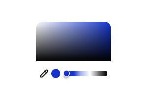
Menu that allows users to select a specific color through a variety of ways.

Combobox

Dropdown menu that helps users enter text or select items from a list.

Content card

Compact displays that summarize or direct users to more information.

Date and time selectors

Interactive calendar or time selector that allows users to choose a specific date or time.

Dialog

Messages that float over page content and provide time-sensitive alerts.

Divider

Visual elements used to separate and group information on a page.

Dropdown menu

Interactive elements that allow users to select a single option from a list.

Flag

Messages that provide low-priority updates about a process or event.

Footer

Content fixed at the bottom of a page to provide important information or links.

Horizontal navigation

Menu placed at the top of a site that links to important pages or features.

Icons and illustrations

Explore Visa-branded and generic icon libraries that represent core functions, ideas, and content.

Input

Text fields that enable users to enter free-form content.

Link

Text-based navigation elements that take users to another destination.

List item

Individual containers that can be grouped to create lists in mobile apps.

Listbox

Container that displays a list of items available for selection.

Multiselect

Control that allows users to select multiple options from a dropdown menu.

Navigation drawer

Collapsible navigation panels that float over page content on small screens.

Pagination

Set of links used to navigate content that’s split between multiple pages.

Panel

Collapsible or persistent containers used to present supplementary information.

Progress

Visual representations of the status of a system process.

Radio

Interactive elements that allow users to select a single option from a list.

Section message

Section-level messages about the status of a page or action.

Select (native)

HTML element that allows users to select one option from a dropdown menu.

Slider

Control that allows users to make a selection along a range.

Switch

Binary control that allows users to toggle between two states like on/off.

Tab bar

Mobile navigation bar that uses icons to navigate between main pages.

Table

Fixed grid that organizes information or data using columns and rows.

Tabs

Organizational element that separates content and allows users to switch views.

Toggle button

Selection element that allows users to switch between states or views.

Tooltip

Short message communicating the function or context of a control or object.

Top app bar

Navigation fixed to the top of mobile apps with logo, links, and global search.

Vertical navigation

Navigation panel located next to page content on screens with sufficient space.

These materials are intended for illustrative purposes only. They are provided AS-IS and should not be relied upon for marketing, legal, tax, financial, regulatory or other advice. Any links to third party sites are for your information only and do not constitute endorsement by or affiliation with Visa. Visa has no insight into and/or control over third party content and code and disclaims all liability for any such components.


Copyright © 2025 Visa. All rights reserved.

  • Terms of Use
  • Careers
  • Legal
  • Privacy Notice
  • Your Privacy Rights
  • Cookie Preferences