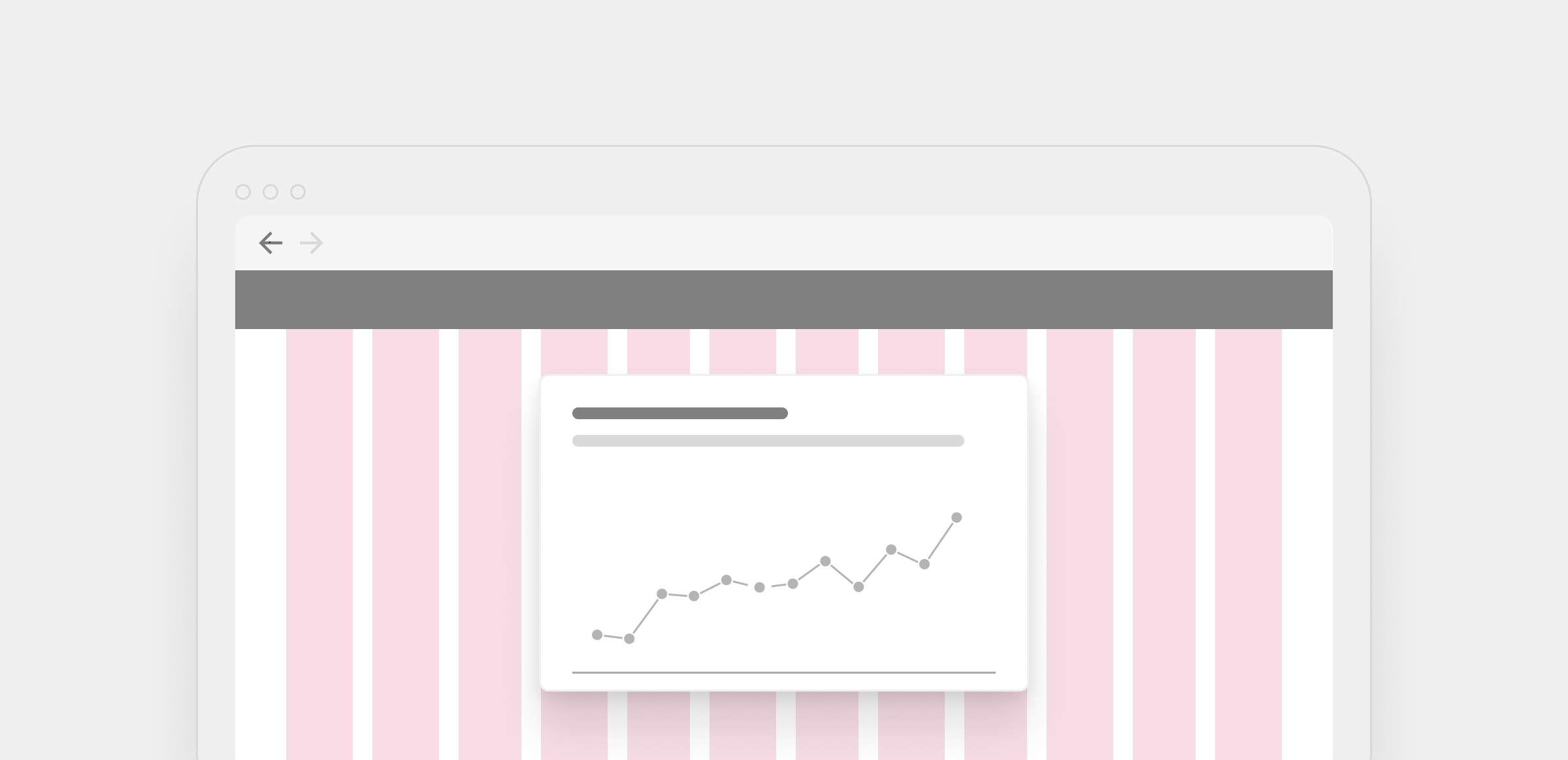
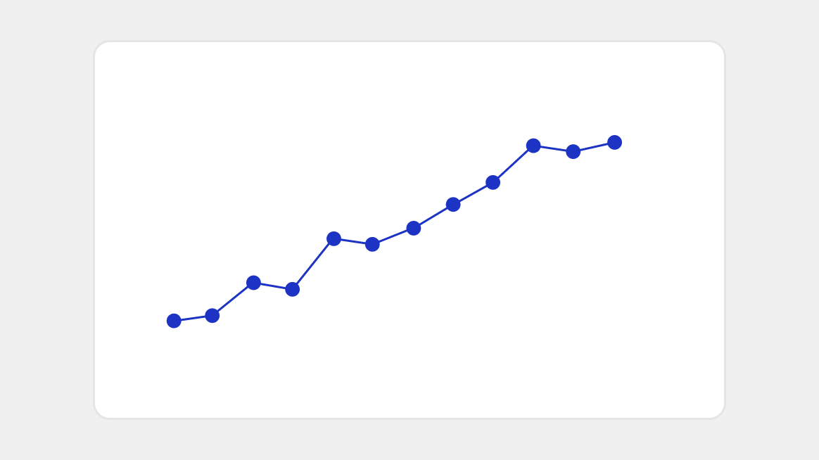
Line chart
Chart showing points connected by line segments, used to represent how a number changes over time.
Line charts use points connected by line segments to represent how a number changes over time. The direction and slope of each line segment reveals the rate of change between data points, making it easy to identify trends and fluctuations.
Also known as: Line graphs, time series charts.
Anatomy

A. Title (optional): Brief text summarizing the contents of the chart.
B. Data table button (optional): UI icon button enabling users to view the chart’s data in table format.
C. Keyboard instructions (required): UI icon button enabling users to access the chart’s keyboard navigation instructions.
D. Subtitle (optional): Additional text providing details, context, or instructions about the chart.
E. Plot canvas (required): Area containing the graphic part of the chart including axes, gridlines, and other elements.
F. Series labels (optional): Text that identifies each line’s category.
G. Vertical axis (required): Scale representing a continuous numeric variable.
H. Data markers (required): Dots representing individual data points and lines representing the relationships between points.
I. Horizontal axis (required): Scale representing a date variable.
Usage
| When to use | When not to use |
|---|---|
| To show how values change over time or across a continuous sequence. | If the individual values are more important than the overall trend. Consider using a bar chart instead. |
| To emphasize overall patterns and trends rather than individual data points. | If the horizontal axis contains categorical or non-sequential data, since line charts imply continuity. |
| To illustrate the rate and direction of change between data points. | If comparing more than five categories which can make the chart cluttered. Consider grouping or using alternative charts. |
| For longer time series where the shape of the trend matters more than exact values. | If the focus is on composition within categories. Consider using a stacked or clustered bar chart instead. |
Best practices
- Select the right chart variant to emphasize the most important takeaways.
- Provide clear explanations, labels and annotations to highlight key data points and help users interpret important findings.
- Always use straight line segments for the most accurate interpretation of data points and trends.
- Use a range of values for the vertical axis that accurately represent the trend and doesn’t exaggerate differences between data points.
- Avoid starting the vertical axis at zero when the minimum value in the dataset is significantly higher.
- Select consistent and meaningful intervals for the horizontal axis to ensure the rate of change is represented accurately.
- Avoid displaying too many data points or lines that could overwhelm users and make the chart difficult to interpret.
Chart size
Chart size should be based on the data within each chart. Use the columns in the Responsive grid system to set the width of the card, as shown below. Adjust the card’s height so the is proportional and accurately represents the shape of the data.
- Ensure charts are wide enough to be interpreted without scrolling or zooming.
Color
Color can be used to emphasize meaningful information and draw attention to the most important information in a chart.
- Color should never be used alone to communicate meaning. For more, visit Accessibility.
- Learn more about using color for data visualization in the Color guidelines (internal only)
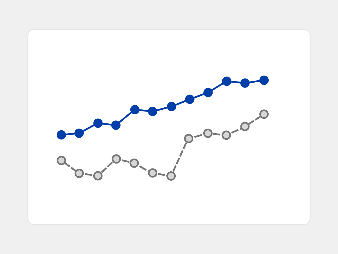
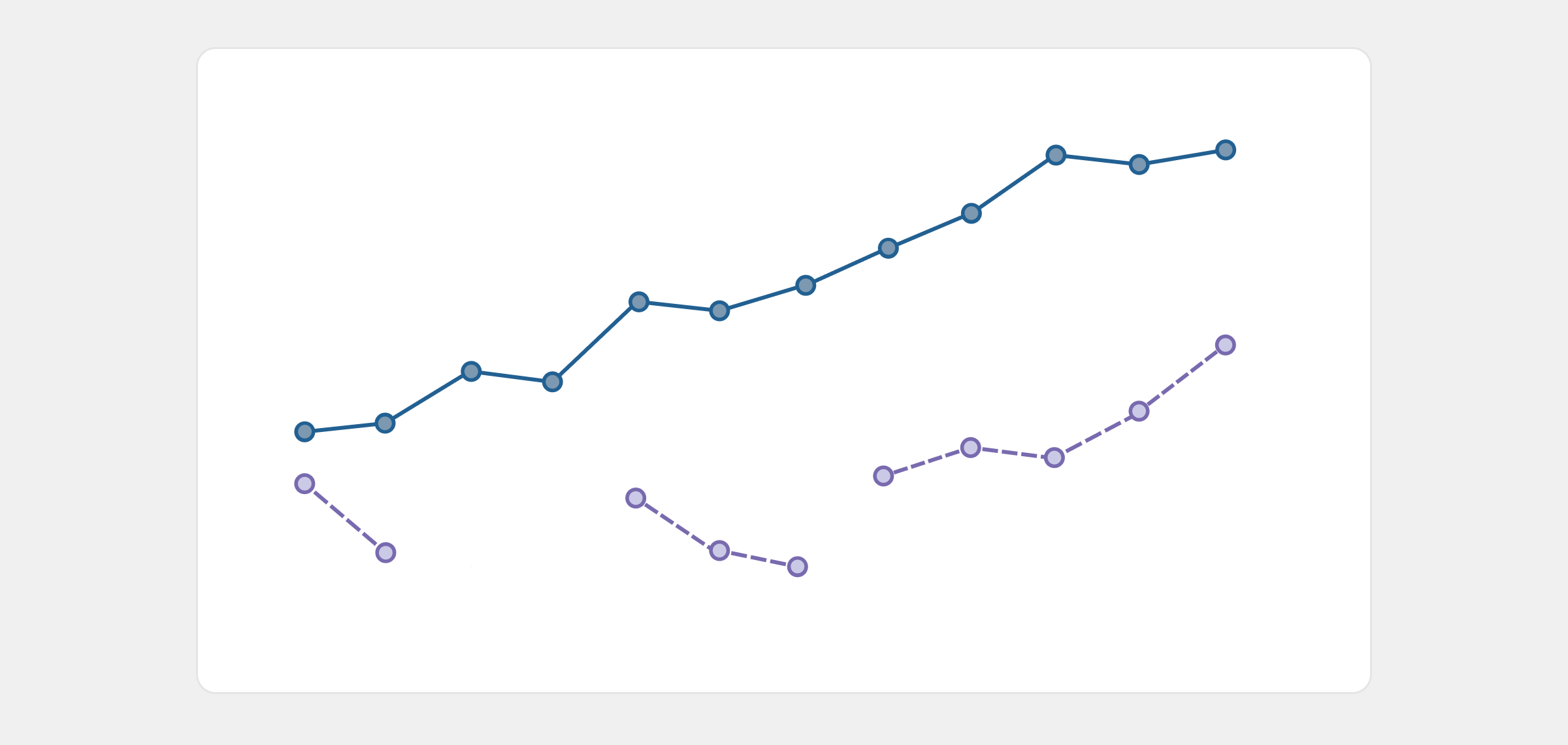
Do Use colors to emphasize important trends, like using the blue and grey highlight palette to show contrast.
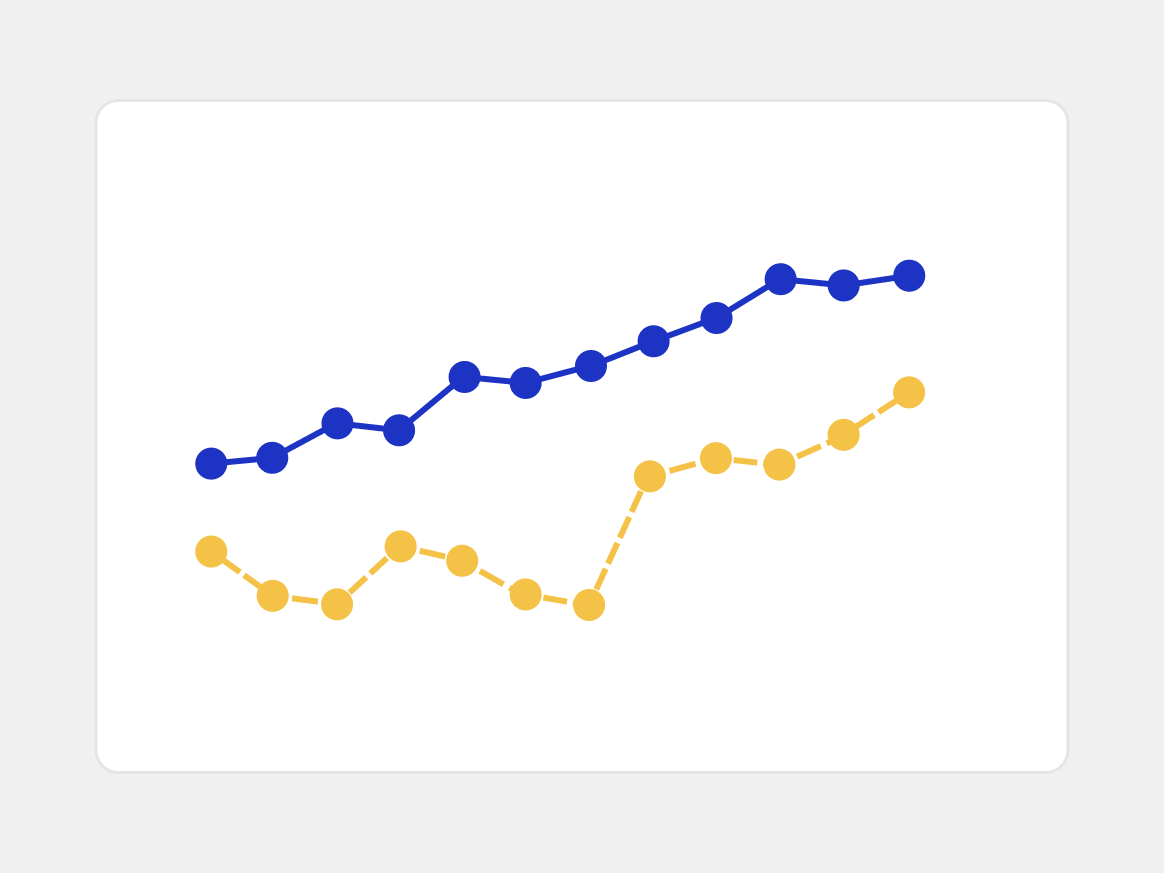
Don't Use multiple brand colors in a line chart, because these make it harder for users to quickly identify where to focus.
Data marker dots
Data markers represent individual data points and can show the progression between points. Users can choose to show or hide data markers with the optional “show dots” feature.
- Choose dot sizes that allow the lines to remain visible and complement the chart without overwhelming it.
Handling missing data
Communicate gaps in the data in a clear and consistent way to help users quickly identify where data is missing and understand its limitations. If a data point is missing, don’t connect the points before and after the gap to ensure it’s clear that no data exists between those data points.
- Be transparent about missing, unknown, or estimated data to help users understand the limitations of the data and prevent misinterpretations.
Direct labeling
Direct labeling refers to placing labels near each data point to communicate precise values. Use direct labeling for data points and line series to make it easier for users to interpret line charts. There are three types of labels in line charts: Data point labels, axis labels, and line series labels.
- Ensure labels don’t clutter the chart or distract from the data by keeping labels short and following number format guidelines.
Data point labels
Show labels as close as possible to the data points they represent to reduce the need for users to look back and forth between the chart and the axis labels.
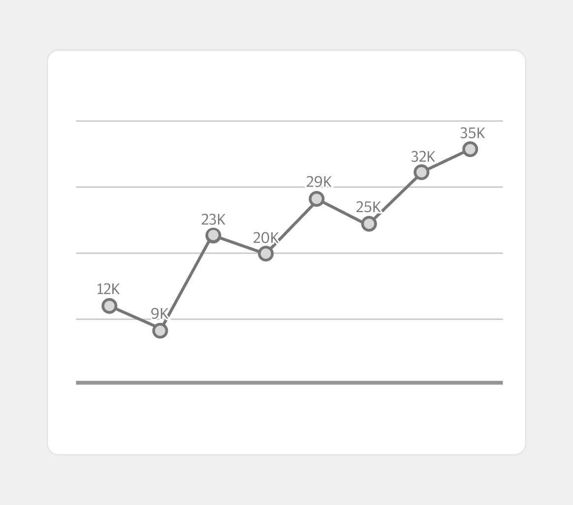
- Label all data points when users should know the specific value of each point.
- Consider hiding the y-axis if you’re showing all data labels.
Axis labels
Show axis labels to help users estimate values for unlabeled data points. Use this method when trends are more helpful than individual values.
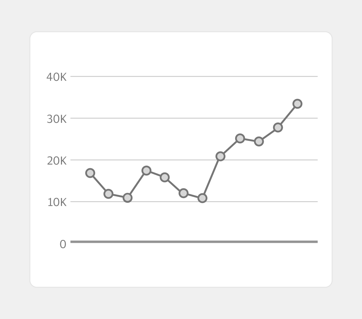
- Use axis labels when directly labeling every data point would overcrowd or obscure the chart.
Line series labels
When a line chart includes multiple line series, ensure users can identify what each line represents. There are generally two methods for this: Labeling lines directly or using a legend.Labeling each line
Directly labeling each line is the clearest method, as users can directly tell what the line represents.
- Show labels close to their lines to ensure users can identify what they refer to.
- Consider hiding the color legend with this method to reduce unnecessary duplicate information.
Using a legend
Using a legend is an alternative method that can be helpful when there isn’t sufficient space to label lines directly.
- Include a legend when directly labeling each line series isn’t possible or would overcrowd the chart.
- Ensure the legend clearly indicates what each line represents using color, line styling, or similar methods.
Content
- Always use sentence case except for proper nouns or acronyms.
- Use plain language and avoid abbreviations or jargon.
- Provide more detailed explanations and definitions for any complex metrics if needed.
- Reference Content for additional guidance on crafting content within apps and experiences.
Titles and subtitles
- Use clear, informative titles to help users understand the chart’s topic and key takeaways.
- Frame titles as a headline that summarizes the trend or insight.
- Use subtitles to add more detail about the data being shown and help users understand how to interpret the chart.
- Consider phrasing titles or subtitles as questions to guide the user’s analysis, especially on exploratory dashboards where users are likely to spend significant time analyzing data.
- Avoid titles and subtitles that are too general or vague.
Labels
- Ensure numbers, dates, and other data or axis labels are formatted consistently.
- Follow plain language principles, such as using shorter and simpler words and phrases.
Number format
Simplify number formats to remove unnecessary details and reduce the mental effort needed to compare numbers. If needed, provide higher-precision numbers in a tooltip for users who want more information.
| Data type | Recommended format |
|---|---|
| Large numbers | Use abbreviated format, such as 1.2k instead of 1,200. |
| Percentage | Use whole percentage points, except for special cases where basis points are needed. |
| Basis points | Use basis points (bps) when change percentage is very small. 1 bps equals 0.01% (0.0001 in decimal format). |
| Currency | Round to the appropriate level of detail that is required for the analysis. For example, for U.S. currency round to the nearest dollar amount. |

