
States are visual cues and design patterns that are consistently applied to components to help the user better understand the interaction. States include default, hover, focus, and more.
Anatomy

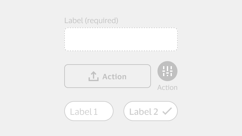
Three sections showing states. Section A shows a default button state is blue, active hover is brighter, focused with a keyboard is brighter and has an extra dotted border, pressed is dark blue, and disabled is gray. The same states are shown again with a white or transparent button, with hover, keyboard focus, and pressed all having a light blue fill. Section B shows a selected chip is blue with a white checkmark. Section C shows three tabs with the first tab active. The active tab has a light gray background and blue line underneath the text.
A. Color: Value of the active and surface color that adjusts based on the component state.
B. Icon: Visual indicator communicating the selected state.
C. Active indicator line and text: Line used to indicate the selected view, with text changing to bold when active.
Component states
Component states support user interactions and guide visual design expectations. Not all components will have all of the following states.
Default
The default, enabled state for all interactive elements and components.

Hover
The state when the mouse pointer is placed over the component. Not used on touch devices.

Pressed
The temporary state indicating a component is being tapped, clicked with a mouse, or triggered with a keyboard.

Focus (keyboard)
The state indicating an interactive component is in-focus during keyboard or voice-activated navigation.

Focus (mouse)
The state indicating an input field has been clicked into and is currently in-focus. This isn’t used for any other components.

Active
The state indicating the currently selected item out of a set, menu, or list.

Selected (on/off)
The state showing the user’s selection, usually from a list of options, a checkbox, or a setting.

Disabled
The inactive state of a component, indicating the action is not available and can’t be interacted with.
Read-only
An inactive state which may show possible or past interactions, or the absence of editing rights.
Expanded
State indicating that a component is expanded, with the menu arrow pointing up.

Error
State that uses color and an icon with text to indicate an error and provide user guidance.

Interactive target areas
Ensuring sufficient space around interactive areas is vital as it facilitates easier interaction, particularly for users who may struggle with precise movements. When using components with smaller visual footprints, it’s important to design with ample touch area in mind and avoid placing elements too closely together.
Touch targets
Use the minimum size of 44 x 44 dps for touch areas across all interactive components.

For additional context, learn more about challenges faced by users with a limited ability to use a mouse.
Non-touch targets
- Use the minimum size of 24 x 24 dps for touch areas across all interactive components.
- Rounded corners detract from 24 x 24 target.
- To learn more about accessibility minimum targets, refer to WCAG guidance.
