Checkbox
Interactive element that lets users select one or more independent choices.
Checkboxes enable users to select one or more options from a short list. They are commonly used in forms, filter menus, or any scenario where users may want to select multiple options from a short list.
Also known as: Check box, tick box, checkBox (Android).
Anatomy

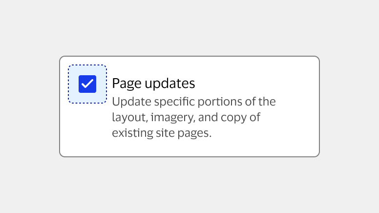
A. Checkbox (required): Interactive element enabling users to select an option.
B. Option label (required): Brief text describing the checkbox option.
C. Description (optional): Brief message detailing important information about the option.
D. Checkbox group (optional): Two or more related checkboxes presented in a group.
E. Group label (required): Brief description of options available for selection.
Usage
| Component | When to use | When not to use |
|---|---|---|
| Default checkbox | To present a binary choice where the user can select or deselect a single option. | To present multiple options the user can choose between. Use a checkbox group instead. |
| Checkbox group | To present a short list of options where the user can select one or multiple. | If users must select one option from a short list. Use a Radio button group instead. For long lists where all options can’t be viewed at once or require scrolling. Use a Multi-select listbox instead. For long lists where users would benefit from entering text to filter or search the list options. Use Multiselect instead. To present a list of actions. Use a Dropdown menu instead. |
| Checkbox panel | To present a binary choice where the user can select or deselect a single option. To provide an increased touch area. | To present multiple checkbox panels in a list. Use a checkbox panel group instead. When space is limited. |
| Checkbox panel group | To present a short list options where the user can select one or multiple. To provide an increased touch area. | If users can only select one option from a list. Use a Radio panel group instead. When space in limited. |
Best practices
- Ensure checkboxes appear visually different when selected and unselected by using the fill color and “check” icon.
- Ensure users can select anywhere within the checkbox or associated option label to choose an option.
- List options in a logical order, either alphabetically or according to the most common or likely selection.
- Avoid using a horizontal layout for checkbox groups and panel groups, as vertical layouts are easier to scan and more adaptable for small screens.
- Always indicate that more than one option can be selected using phrasing like “Select one or more options”.

Do Use one checkbox for each selectable option in a group.

Don't Use a checkbox to prompt actions or other controls.
Standalone checkboxes
Standalone checkboxes refer to checkboxes used alone to present a single, independent option that doesn’t relate to any others. They’re typically used to enable settings, agree to terms and conditions, or present a binary choice, where selecting the checkbox indicates agreement and not selecting indicates disagreement.
- Use the default checkbox component to present a standalone option.
- Frame options so that selecting the checkbox indicates agreement and not selecting the checkbox indicates disagreement.

Do Use a standalone checkbox to present a choice with a clear opposite state such as yes/no, agree/disagree, or opt-in/out.

Don't Use two checkboxes to present opposite choices, as users could select both checkboxes at once.
Checkbox panels
Checkbox panels are an alternative to default checkboxes. They’re available as standalone elements or in groups and can be used to draw attention to the checkbox or provide an increased touch area on small screens.
- Ensure users can select anywhere within the checkbox, label, or panel to choose an option.

Do Use panel states with the checkbox panel component.
Don't Use checkbox states with the checkbox panel component.

Do Use checkbox panels to draw attention to a standalone checkbox or checkbox group.

Don't Use too many checkbox panels in the same area, as they may be visually overwhelming.
Checkbox groups
Checkbox groups and panel groups are sets of default checkboxes or checkbox panels placed under a single group label. They’re commonly used to present a short list of related options available for selection.
- Use a checkbox group or panel group for short lists where all options can be viewed without scrolling.

Do Use a checkbox group when there are multiple options available under the same category or prompt.

Don't Use standalone checkboxes when options could be consolidated under one group label.
Label size for panel groups
Group labels for panel groups are available in two sizes. Use whichever is appropriate depending on your use case and the overall hierarchy of your experience.
Default
The default option is the UI label font size and matches the text in option descriptions.

- Use the default size to reduce visual weight for users when multiple checkbox panel groups are used together.
Large
The large UI label size is an alternative option that can be used to draw attention to the checkbox panel group label.

- Use the large size to draw attention to a standalone checkbox panel group.
Hidden labels
Checkbox groups and panel groups should always include a group label. However, there are some cases where hiding the group label can provide design flexibility or space for additional context. If the group label within the component build is hidden, include an alternate label elsewhere on the screen as well as within the code for accessibility.

Nested options
In some cases it may be appropriate to format checkbox groups with nested options. Users can select all nested options by selecting the parent or top-level checkbox, or unselect all nested options to by unselecting the parent checkbox. Alternatively, users can select nested options individually when the parent option is not selected. When the parent checkbox shows the indeterminate state, selecting it causes all nested options to be selected.
- Ensure all nested options are related to the parent option.
- Use the unselected state for the parent option when all nested options are unselected.
- Use the selected state for the parent option when all nested options are selected.
- Include a chevron UI icon button to enable users to expand and collapse the nested options.
Note: The indeterminate state is not fully accessible for screen readers. To learn about alternative methods for nested checkbox groups, visit Accessibility.
Collapsed
The user selects the chevron UI icon button to reveal the nested options.

- Use the right pointing chevron to indicate collapsed content.
Expanded
The user makes their selection from the available nested options.
- Use the downward pointing chevron to indicate expanded content.

Do Ensure a clear distinction between checkbox actions and chevron actions to prevent accidental selections.

Don't Place checkboxes too close to the chevron UI icon button to avoid accidental selections.

Do Use the indeterminate state for the parent option when some but not all nested options are selected.

Don't Use the indeterminate state for checkboxes that aren’t the parent of a nested group.
Default selections
In general, checkboxes should be unselected by default to give users full control over their choices. The main exception is when a choice is required and the selection indicates a default or system setting.

Do Select the safest, most secure, and private option if a default selection is necessary.

Don't Use the indeterminate state for checkboxes that aren’t the parent of a nested group.
Optional vs. required labels
Always ensure required fields are clearly labeled. While this may seem repetitive, it helps users scan for necessary information and reduces errors. There are two methods for labeling required fields based on your use case. Whichever method you select, use it consistently across your experiences.
Note: Previous VPDS guidance recommended only marking optional fields. Our guidance has been updated to reflect current Nielsen Norman Group recommendations. Learn more about optional vs. required labels in Forms.
“Required” in the label (preferred method)
Including “required” within the label ensures it’s easy to find, particularly when instructions at the top might not be visible while scrolling. This method bolsters accessibility for both sighted and non-sighted users.

- Mark all fields that are required. This ensures you’re as explicit and transparent as possible.
- Include “(required)” in field label with a space between the last word and the first parenthesis.
Asterisk in the label (alternative method)
Asterisks are commonly used to indicate required fields. The main advantage to using this method is that it doesn’t take up much space, helps users along a common edge, and can be used in addition to formatting hints in the label.

- Always include a legend or key at the top of the content area noting that the asterisk indicates a required field.
- Place the asterisk at the beginning of the label with a space between the symbol and the first word.
When required is implied
Although it’s usually recommended to label required fields, there are cases where it’s implied that the field is required. This is common when there’s a one or two fields fundamental to completing of a task, like the username and password fields on a login screen. In these cases, marking the fields required isn’t necessary but can add additional clarity.Labeling optional fields
It’s not generally necessary to mark which fields are optional. While doing so can support clarity, it also adds unnecessary visual noise. Whatever you choose, apply the choice consistently to avoid confusion.Content
- Always use sentence case except for proper nouns or acronyms.
- Use plain language and avoid abbreviations or jargon.
- Visit Content for additional guidance on crafting content within apps and experiences.
Descriptions
- Use full sentences with proper punctuation.
- Limit descriptions to 80 characters or 20 words including spaces.
Labels
- Don’t include punctuation.
- Ensure group labels accurately summarize the options available for selection.
- Limit labels to three words or fewer unless referencing proper nouns, such as product names.
- Use Parallel structure for labels across your experience, either starting with verbs such as “Select a notification preference” or nouns such as “Notification preferences”.

Do Phrase labels so the statement is true when selected.

Don't Include multiple options in one label.
Platform considerations
Mobile
Checkboxes are available in mobile and web and should be implemented similarly on both platforms.
- Use checkbox panels to provide a larger touch area when necessary.
- Use default checkboxes to save space and prevent user overload, especially when there are many checkbox groups used together in a form.


