Input
Text fields that enable users to enter free-form content.
Input fields allow users to enter free-form text or data. They are commonly used across long and short forms but can also appear as standalone elements like search bars.
Also known as: Text field, input field, text input, text box, form field, text area, UITextField (iOS), EditText (Android).
Anatomy

A. Label (required): Text indicating the purpose of the field and if the information is required.
B. Input (required): Text field enabling users to enter the requested information or data.
C. UI icon button (optional): Button controls relevant to the field. Visit Button to learn more.
D. Leading icon (optional): Non-actionable icon at the beginning of the field indicating the purpose.
E. Inline message (optional): Text communicating format requirements or relevant guidance.
F. Vertical scroll (optional): Bar allowing users to scroll through long, multi-line entries.
G. Corner drag (optional): Visual indicator communicating that the field may be expanded by dragging.
H. Character counter (optional): Fraction indicating the number of current and maximum allowed characters.
Usage
| Component | When to use | When not to use |
|---|---|---|
| Default, single line | If the expected entry is a single line of text. For unique information that can’t be predicted with preset options. For memorable data that can be entered faster in a free-form format. | If the expected entry is more than one line, use multi-line instead. For predetermined options, use select components, such as Select (native) or Combobox. |
| One-time passcode | For single-use passcodes for verification purposes | For entries other than a one-time passcode. |
| Multi-line or text area. | If the expected entry is more than a single line and spans multiple lines. | If the expected input is a single-line response, use default instead. |
| Prefix-suffix | To indicate the expected entry is a unit of measurement or currency. | In place of leading or trailing icons or inputs without a unit of measurement or currency. |
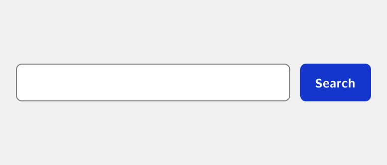
| Search field | For search where users can enter information and discover results. | For fields that do not return search results. |
Best practices
- Ensure the length of the input field matches the expected entry length.
- Order fields to match user expectations. For example, “First name” followed by “Last name”.
- Learn more about using input fields in forms in Forms.

Do Use inline messages to provide additional context, such as format hints, real-time feedback, or interaction guidance.

Don't Use placeholder text to provide format hints, as it disappears when users start typing and may be hard to remember.
Leading icons
Leading icons are placed at the beginning of an input field and are not interactive elements. They visually indicate the type of information required, such as a mail icon for an email field.
- Use one leading icon per input field as multiple icons can confuse users.
- Use icons that are universally understood and directly correlate to expected entry.
- Use leading icons consistently across experiences to help users learn and predict behavior.
UI icon buttons
UI icon buttons are placed at the end of an input field and are visual representations of actions the user can take.
- Only use one UI icon button per input field to ensure users have a single, clear action.
- Always place UI icon buttons in the trailing position of an input field.
- Ensure icons clearly and intuitively indicate the action they represent.
Show/hide input value
Show/hide is an optional feature that allows users to display or hide inputted data, such as passwords. The icon button shows the opposite of the current state of the input display.

- Use the show/hide feature wisely, especially for sensitive data. By default, passwords should be hidden.
Combobox
Chevron down icon is a UI icon button that prompts an option menu. The icon shows the direction the menu will expand when selected. For more info, reference Combobox.

- Ensure the chevron points downwards when the menu is collapsed and upwards when the menu is expanded.
Information icon button
Information icon is a UI icon button that prompts an inline message with additional guidance when selected. For more information, reference Card input.
- Ensure the icon is universally recognized as an information symbol, usually a lowercase ‘i’ in a circle.
Date selector
Calendar icon is a UI icon button that prompts a dropdown menu allowing users to select a date instead of typing. For more information, reference Date selector.

- Always provide users with the option to enter the date in addition to selecting the date within the menu or modal.
Prefix and suffix usage
Prefix and suffix components are input fields with fixed expected data formats. The prefix-suffix component type automatically formats input to matches the expected type. For example, inputs with a “$” only accept monetary values and can auto format to include decimal points or commas in certain regions.
Follow regional expectations when formatting currencies and when considering which units of measurement to use. Learn more in Grammar and punctuation.
- Only use a prefix or suffix for inputs that require specific formatting, but don’t over use them.
- Use universally recognized currency symbols that are easy to understand and distinguish from the input value.
- Autoformat as the user types, but always ensure validation aligns with expected prefix or suffix symbols or codes.
Prefix
Prefixes are commonly used to indicate currencies, such as “$” or “€” and international international phone codes.

- Consider regional norms for currency formatting. This includes the placement of currency symbols (before or after the value) and use of decimal points or commas as thousands separators, which differ across countries.
Suffix
Suffixes are commonly used to indicate the unit of measurement or data format expected in the field.

- Adhere to regional conventions when it comes to measurement systems. For example, some countries use the metric system (kilometers, kilograms, liters), while others use the imperial system (miles, pounds, gallons).
Hidden labels
Typically, input fields should always include a label. However, in certain contexts such as search fields, the purpose of an input field can be understood without a visible label. In these cases, remember to include the label within the code to support screen readers and speech input software.
Generally, there are two methods used to provide context when labels are hidden. It’s important to choose a method and apply it consistently across your experiences.
Text and icon buttons
The most common method is positioning a button (text or icon) beside the input field to provide context.
- Use clear labels indicating the outcome for text buttons.
- Use icons for icon buttons that are easy to recognize and understand. Visit Button to learn more.
Leading icons and placeholder text
In some scenarios, using an icon and placeholder text ensures there are two visual indicators to provide context.

- Use placeholder text as a temporary label in addition to the leading icon.
- Use icons that are easy to recognize and understand.
Optional vs. required labels
Always ensure required fields are clearly labeled. While this may seem repetitive, it helps users scan for necessary information and reduces errors. There are two methods for labeling required fields based on your use case. Whichever method you select, use it consistently across your experiences.
Note: Previous VPDS guidance recommended only marking optional fields. Our guidance has been updated to reflect current Nielsen Norman Group recommendations. Learn more about optional vs. required labels in Forms.
“Required” in the label (preferred method)
Including “required” within the label ensures it’s easy to find, particularly when instructions at the top might not be visible while scrolling. This method bolsters accessibility for both sighted and non-sighted users.

- Mark all fields that are required. This ensures you’re as explicit and transparent as possible.
- Include “(required)” in field label with a space between the last word and the first parenthesis.
Asterisk in the label (alternative method)
Asterisks are commonly used to indicate required fields. The main advantage to using this method is that it doesn’t take up much space, helps users along a common edge, and can be used in addition to formatting hints in the label.

- Always include a legend or key at the top of the content area noting that the asterisk indicates a required field.
- Place the asterisk at the beginning of the label with a space between the symbol and the first word.
When required is implied
Although it’s usually recommended to label required fields, there are cases where it’s implied that the field is required. This is common when there’s a one or two fields fundamental to completing of a task, like the username and password fields on a login screen. In these cases, marking the fields required isn’t necessary but can add additional clarity.Labeling optional fields
It’s not generally necessary to mark which fields are optional. While doing so can support clarity, it also adds unnecessary visual noise. Whatever you choose, apply the choice consistently to avoid confusion.Behaviors
Input fields have optional behaviors and features you may implement based on use case. Learn about these below.
Autocomplete
Autocomplete is a feature that predicts a user’s input based on previous entries or a predefined list. As a user types within an autocomplete-enabled field, the system presents a dropdown of suggestions. Selecting a suggestion fills the entire input field with that choice. Autocomplete is often used in form fields such as name, email, and address, and can also be used in search fields. However, it’s often more effective and user-friendly to use autosuggest in search fields.
Note: Autocomplete is typically enabled in most browsers by default. However, this depends on user settings or how your browser is managed by your organization. The visual representation and functionality of autocomplete formats can vary depending on the browser. Different browsers handle autocomplete differently, from the way they store and suggest input data to the visual presentation of suggestions. The example below is a general representation of the functionality.

- Disable autocomplete for fields that contain sensitive information, like credit card numbers or one-time passcodes.
- Consider styling limitations, for example the autocomplete dropdown provided by browsers has limited styling options.
- Test autocomplete-enabled fields in various browsers to to ensure it works consistently and effectively across browsers.
Autosuggest
Autosuggest, like autocomplete, suggests options based on user input. However, it generates suggestions dynamically from a database or possible inputs, not just past entries. Autosuggest is commonly used in search fields for suggesting search terms or products. Remember, different applications handle autosuggest differently, from suggestion generation and presentation to dropdown menu interaction.
Note: Implementing autosuggest requires significant development effort compared to native autocomplete. Its effectiveness relies on having relevant, quickly retrievable data. Components do not include search functionality by default. If search-like behavior is needed, this must be considered and implemented separately, which may require significant and additional development effort or potentially re-architecting the application.

- Order suggestions intuitively by listing the most likely options first, common selections, or based on previous interaction.
- Limit options between 5 and 10 to avoid overwhelming users with too many suggestions.
- Test autosuggest for consistency in function, responsiveness, result accuracy, and visual presentation across browsers.
Character counter
Character counters provide users with real-time feedback of the number of remaining characters and indicate when the limit has been reached. This feature is often used with multi-line or text area fields and helps users plan their entry accordingly.
-
Avoid imposing arbitrary character limits. Instead, set limits that align with the anticipated length of the user’s entry or that are based on the actual requirements of the field or technical constraints.

Do Display real-time updates while the user types or deletes characters, providing immediate and accurate feedback.

Don't Prevent users from continuing to type once they reach the limit as it can lead to confusion and lost work.

Do Inform users when they have exceeded the character limit.

Don't Display characters over the limit as negative characters remaining.
Clear text button
Clear text button within input is a user interface (UI) element that allows users to quickly and easily erase all the text in a field. This is typically represented by a small ‘x’ or similar icon within the field itself and facilitates quick erasure for new entries, such as in search fields.

- Only include a clear button only when useful for resetting to a blank state, such as search fields.
- Avoid clear buttons for short input fields like age or zip code, where users can easily delete characters.
- Provide immediate feedback by instantly clearing the text field when button is selected.
- If possible, provide a way to undo the action, in case the button is selected accidentally.

Do Hide clear text buttons when fields are not in focus prevent users from accidentally clearing data.

Don't Include a clear text button for multi-line input fields where users could loose substantial content by accident.
Flexible input
Flexible input, which allows users to input information in a variety of formats, enhances user-friendly experiences. It eases cognitive load, boosts efficiency, and caters to regional preferences. For example, when asking for a phone number, accept the number with or without dashes, parentheses, or country codes. Similarly, for a date field, accept input in different formats like “MM/DD/YYYY”, “DD-MM-YYYY”, “Month Day, Year”. Learn more about formatting dates in Grammar and punctuation.

- Work with developers early and often to ensure robust validation is in place to confirm data is in an acceptable format.
- Test all possible input scenarios to ensure your flexible input works as expected and handles edge cases gracefully.
- Be mindful of the potential performance impact as each input variation requires different processing and validation logic.
Content
- Use simple language—avoid abbreviations or jargon.
- Use sentence case, except for proper nouns or acronyms.nput fields have optional behaviors and features you may implement based on use case. Learn about these below.
Labels
- Limit labels to a maximum of three words.
- Ensure labels accurately represent the expected input to reduce errors.
- Use parallel structure across labels, using either nouns like “Email” or verbs like “Enter email”.
Inline message
- Limit all inline messages (including errors) to one to two short sentences with punctuation.
- Use inline messages to provide additional guidance such as format or specific syntax or values to help avoid errors.
- Provide concise, descriptive, and helpful guidance about the field’s usage and necessity, avoiding technical jargon.
Inline error message
- Use inline error messages to draw attention and to errors without causing frustration.
- Provide clear, prescriptive guidance on correcting the error. Avoid redirecting users to another page to fix it.
- Communicate whether the problem can occur again and offer an alternative backup solution in case it does.

Do Ensure messages are consistently placed beneath the input.

Don't Place the error message above or group below a set of errors.

Do Help users correct minor mistakes that don’t relate to usernames and passwords.

Don't Give specific details on how to fix usernames and passwords for security reasons.

Do Educate the user and help them understand why there’s an error, such as a required field being left blank.

Don't Use vague language that doesn’t tell the user why the error is occurring.

Do Use precise language to indicate the required information.

Don't Use negative words if the user made a mistake.

