Toggle button
Selection element that allows users to switch between states or views.
Toggles are selection tools, typically used to change the view of page information or apply a setting. They’re typically used in data visualization contexts like tables or graphs, forms, search results, and settings pages.
Also known as: Flip button, state button, selector, UISegmentedControl (iOS), toggle button (Android).
Anatomy

A. Label (optional): Text describing the toggle button.
B. Icon (optional): Leading or trailing icon used instead of a label or to enhance its meaning.
Usage
| Component | When to use | When not to use |
|---|---|---|
| Single-select | To change the view of a dataset. When only one button can be active at a time. | To change between pages or content sections. Use tabs instead. |
| Multi-select | To apply settings. When any number of buttons may be active, including none. | To perform actions or to group unrelated concepts. |
Best practices
- Don’t use toggles in place of radio buttons or checkboxes.
- Ensure toggles within the same group are related and apply to the same element within the interface.
- Place toggles near the element they control to ensure their purpose and function is clear.
- Limit toggle groups to four or five buttons to avoid overwhelming users.
Do Ensure toggle buttons are related to views or settings.

Don't Use toggles to perform actions or group unrelated concepts.

Do Use icon-only toggles to save space.

Don't Use unfamiliar or unrecognizable icons.
Behaviors
Toggle buttons have two functionalities:
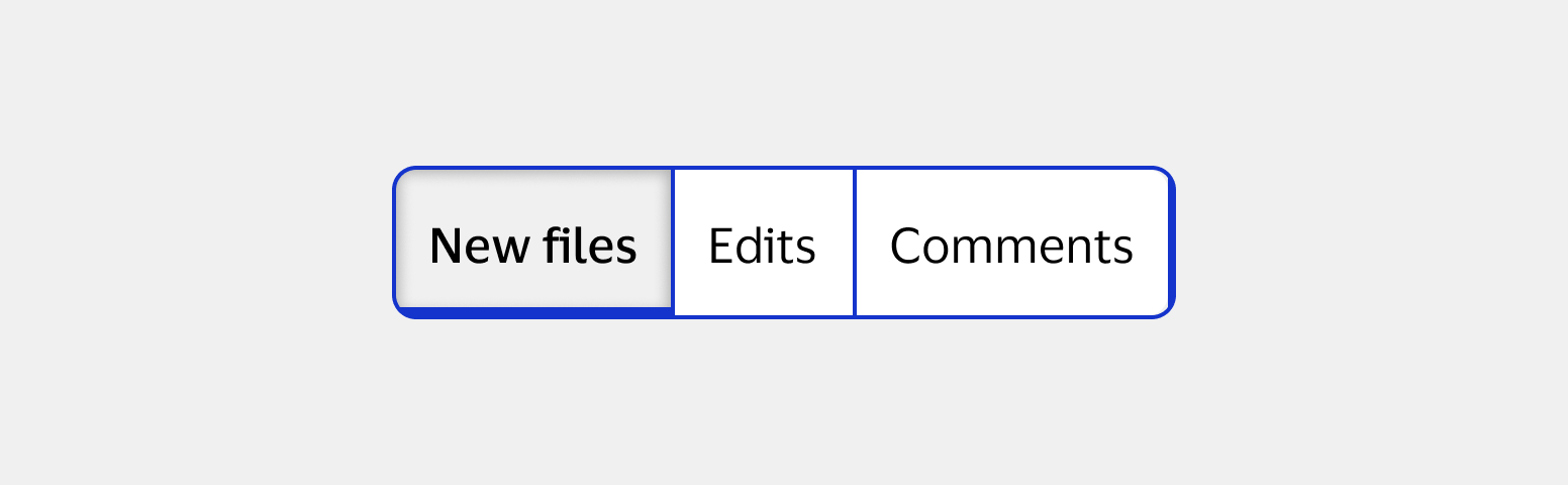
Single-select
Single-select toggle buttons can only be selected one at a time. They represent options that can’t be applied at the same time, like separate views of a dataset. One button is always active, and selecting an inactive button deactivates the active button.

Multi-select
Multi-select toggle buttons can have any number of buttons selected, including none. They’re commonly used to apply settings. Selecting an inactive button does not affect any active buttons. This is the only type of toggle that can be used alone to represent a single option.

Content
- Use sentence case without punctuation for all labels.
- Avoid acronyms or jargon.
- Keep labels short to avoid unnecessary truncation.
- Phrase labels so selecting the toggle makes the statement true.


